
Gander
The owners of the Gansevoort Hotel Group of New York reached out to me asking if I’d design a brand identity for their new cafe and cocktail bar opening in the summer of 2021. These are the assets I created for them.
↓ see below for why "gander"


Beyond aesthetics, the newest addition to the Gansevoort lineage needed to evoke the impeccable service and extraordinary design guests keep coming back for.
The café has its own street-side entrance while being conveniently shared with the hotel lobby, making it as much of a chic venue for the public as for hotel guests.
The two being independent yet connected invited the opportunity to relay that connection in the café’s name…but how?
Gansevoort is a Dutch word meaning goose. As birds of a feather, the hotel and cafe fly together in service, location, and ownership. Immediately aviary references came forward as a way to bridge the brands by name.
What’s made the hotel the downtown hotspot it is will do the same for the café. How guests are treated at the hotel, is how café patrons will be treated. Thus, what’s good for one is good for the other.
The shared bloodline and guest experience made the Gander (a nod to the proverb, “What’s good for the goose, is good for the gander”) the easy choice as the name to introduce the new brand as a welcomed addition to the iconic Gansevoort family.
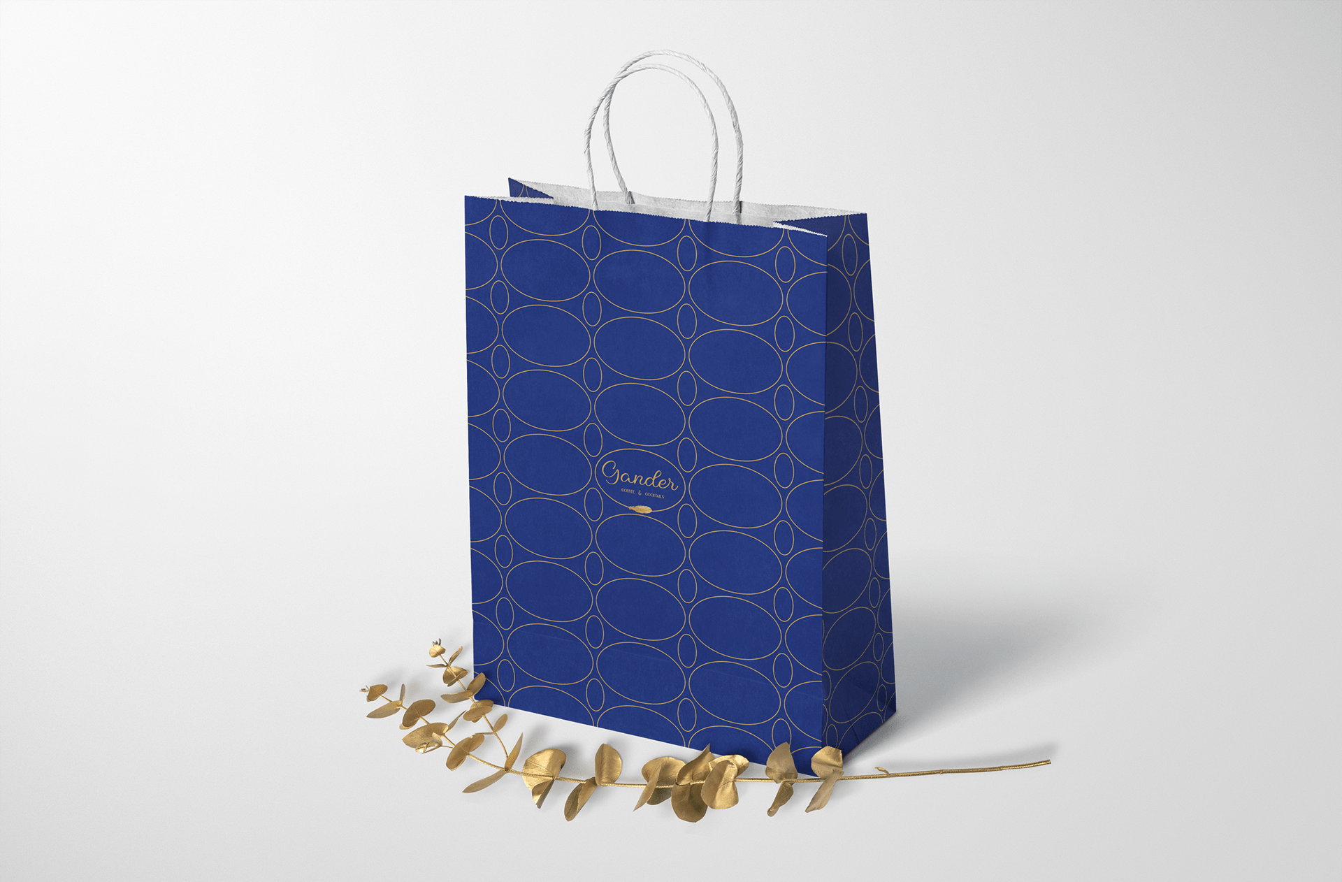
The café’s rich gold and royal navy interior stirred up images of golden goose eggs, luxurious down feathers, and migratory patterns over water through clear skies to inform the design of the logo and employee uniforms.
The café’s menu would play further to the theme, borrowing from fairy tales and children’s stories, with witty drinks such as First Flight and Golden Goose to make the Gander a place to bring out both the kid and adult in all of us.